As an NCIDQ Certified Interior Designer, I will be posting articles about interior design occationally. The first one I am posting is an article I previously wrote for another fabulous blog: Design Dazzle. My article can found here. It is a great article about how using complementary colors are important in design. And, this article was recently referenced on Sherwin William's website Stir which can be seen here. (How cool is that?)
So please, check out the above links and enjoy my article!
There is an old story of a famous Hollywood star who wanted to redecorate the interior of her home in purple. Purple is historically the color reserved for royalty and the elite, so I assume that it only seemed fitting to her that she have her home reflect that status. She hired a designer to help with her project. She made it very clear to the designer that she wanted to use only purple in her space. Under no circumstances was there to be any yellow in the space, as she deplored the color yellow. So, as any good designer would do, she took her client very seriously and together they meticulously planned the perfect home, using purple almost exclusively. One of the few deviant colors in this space was the neutral tan carpet. I can only imagine how many times the designer checked and rechecked her work throughout the entire design process to make certain that all was ordered correctly.
Once everything was installed, the designer received an irate phone call from her client; she was livid with the designer for the yellow carpet in her home! I can only imagine how frustrated and confused the designer must have been. She checked and rechecked all her orders and delivery slips to ensure that everything was ordered and installed correctly, which, of course, it was.
In the designer’s meticulous designing, planning, and the care she took to ensure that the client had an exclusively purple design, she neglected one crucial color theory principle: when the eyes are overwhelmed with one color, both the eye and the brain, seek the respite associated with the color’s complement. The brain automatically seeks out the color’s complement and, if it cannot be found, it will create the illusion of that color in the space. In the case of this home, the massive amount of purple overwhelmed the senses and caused the eye and brain to seek out and create purple’s complementary color, yellow, in the tan carpet. There was, in fact no yellow in the space, but the space was designed in such a way that the illusion of yellow carpet was created, thus making an angry client and what I can only imagine would be a mortified designer.
The moral of this story is quite simple: when designing a room, it is important, in order to create a calm and peaceful atmosphere - one in which the eye and brain can relax - to incorporate both a color and its complement.
Complementary colors are colors that are opposite each other on a color wheel. Thus red and green are complements, purple and yellow are complements, and blue and orange are complements. Complementary colors are interesting to work with in spaces, because, when placed beside each other in equally intense forms, they can almost appear to vibrate. This is not the effect most of us want in our homes. But, when placed tastefully in a room, they can create a wonderfully colorful, yet incredibly well designed, sophisticated room.
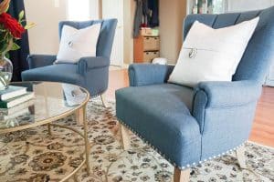
When working with complementary colors it is not important, and generally not advisable, that the complementary colors exist in the room in equal parts. Thus if one prefers purple to yellow, only a tiny bit of yellow need be placed in the primarily purple room. It is equally important to note that the complementary colors do not need to exist in the room in equal saturation (intensity) or in equal value (lightness or darkness). We often see rooms with red and green in them. If both red and green are equally bright and saturated, we typically think Christmas. If the green is a bit more subdued (think sage green) and the red is a bit richer and warmer (think a deep, dark red) then both colors can exist in the space without it looking like Christmas.
Complementary colors are fun to experiment with in a room and can help create the contrast, movement, and richness that most of us want in our spaces. It is the goal of every one of us, whether we be a professional designer or a layman redecorating his or her home, to remember that when dealing with color, it is not always as straightforward as we would hope. Color is seen, not on its own, but in relationship to the colors and the light surrounding it. Color is instrumental in creating the mood and feel of a room and is one of the most powerful tools we have in the design world. It is important to exercise care in how we use color and to realize that using only the colors we love can create unwanted effects in our space.






Leave a Reply